Python Bokeh plotting Data Exploration Visualization And Pivot Tables Analysis
This is a quick walk through Bokeh data exploration and visualization and also python pivot_tables (credit to pbpython on the pivot_tables).Visualization Dashboard
|
1 2 3 4 5 |
import sqlalchemy import pyodbc from pandas import DataFrame from bokeh.plotting import figure, output_file, show import pandas as pd |
|
1 2 3 4 5 6 7 8 9 10 11 12 13 14 15 16 17 18 19 20 21 22 |
df = DataFrame ## connect to SqlServer Database and get information. try: import urllib params = urllib.quote_plus("DRIVER={SQL Server Native Client 11.0};SERVER=.\MSSQLSERVER_ENT;DATABASE=Antrak;Trusted_Connection=yes;") engine = sqlalchemy.create_engine('mssql+pyodbc:///?odbc_connect=%s"' % params) resoverall = engine.execute("SELECT top 10 * FROM FlightBookingsMain") df = df(resoverall.fetchall()) df.columns = resoverall.keys() except (RuntimeError, TypeError, NameError): print('Error in Conneccting') print(RuntimeError, TypeError, NameError) finally: print("connected") |
|
1 2 |
#lets look at the head of the dataframe df.head() |
|
1 2 3 |
#lets define the bokeh figure, and declare the x axis as type datetime p = figure(width=800, height=350, x_axis_type="datetime") |
|
1 2 3 |
#lots plot both a circle and line graph p.circle(df['Booking Date'], df['AFP'], size=4, color='darkgrey', alpha=0.2, legend='close') p.line(df['Booking Date'], df['Total Cost'], color='navy', legend='avg') |
|
1 2 3 |
# show the results output_file('linegraph.html') show(p) |
|
1 2 3 4 5 6 7 8 9 10 11 |
# bokeh server plotting #sample server plotting code from bokeh from bokeh.plotting import figure, show, output_server p = figure(title="Server Plot") p.circle([1, 2, 3], [4, 5, 6]) output_server("hover") show(p) |
I came across this brilliant analyis by pbpython. and decided to play around with it on this data. you can see the full code and explanation on his website: http://pbpython.com/pandas-pivot-table-explained.html. Though I have added just a little bit of some extra exploration, the key and major analysis are from pbpython so you can check him out.
For convenience sake, let’s define the SEX column as a category and set the order we want to view.
This isn’t strictly required but helps us keep the order we want as we work through analyzing the data.
|
1 2 |
df['Sex'] = df['Sex'].astype('category') df['Sex'].cat.set_categories(['m','f'], inplace=True) |
The simplest pivot table must have a dataframe and an index . In this case, let’s use the Name as our index.
|
1 |
df['Booking Date'] = pd.to_datetime(df['Booking Date']) |
|
1 2 3 |
#get year from date df['year'] = df['Booking Date'].apply(lambda x: x.year) |
|
1 2 3 |
#get month from date df['month'] = df['Booking Date'].apply(lambda x: x.month) |
|
1 |
df.head() |
|
1 2 |
#get all data less than a particular date df[df['Booking Date']<'2014-10-28'] |
|
1 2 |
year_plot = pd.pivot_table(df, index=['year']) year_plot |
|
1 2 3 |
p.line(df['year'], df['Total Cost'], color='darkgrey', alpha=0.2, legend='year plot') output_file('linegraph.html') show(p) |
|
1 |
pv_result = pd.pivot_table(df, index=['Last Name']) |
|
1 2 |
type(pv_result) pv_result |
You can have multiple indexes as well. In fact, most of the pivot_table args can take multiple values via a list.
|
1 |
pd.pivot_table(df, index=['Last Name','Booking Date','Departure Date']) |
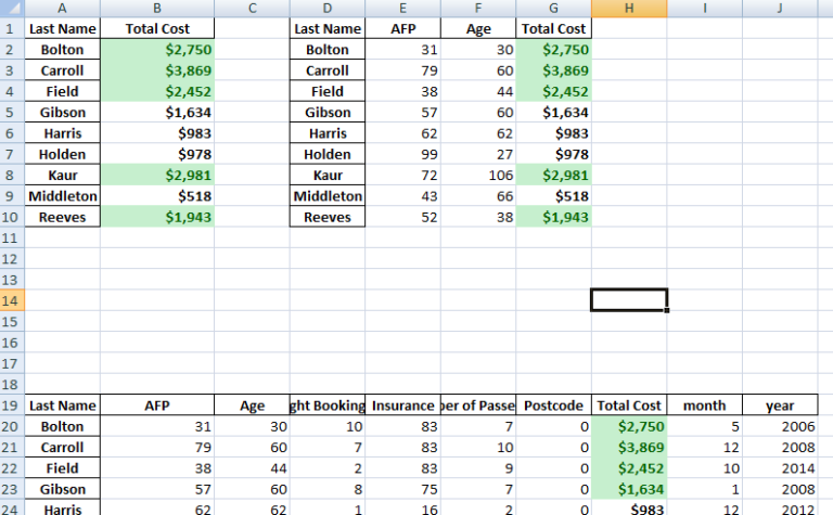
For this purpose, the Flight Booking ID, Insurance and Postcode columns aren’t really useful. Let’s remove it by explicitly defining the columns we care about using the values field.
|
1 |
pd.pivot_table(df, index=['Last Name'], values=['Total Cost']) |
The price column automatically averages the data but we can do a count or a sum. Adding them is simple using aggfunc and np.sum .
|
1 |
pd.pivot_table(df, index=['Last Name'], values=['Total Cost'], aggfunc=np.sum) |
aggfunc can take a list of functions. Let’s try a mean using the numpy mean function and len to get a count.
|
1 |
pd.pivot_table(df, index=['Last Name'], values=['Total Cost'], aggfunc =[np.sum,len]) |
I think one of the confusing points with the pivot_table is the use of columns and values . Remember, columns are optional – they provide an additional way to segment the actual values you care about. The aggregation functions are applied to the values you list.


