Various Types of Basic Charts For Data Analysis and Exploration – Visualization and Meaning
Sometimes, you need some charts to explore your data and many times when your analysis is done and you want to report, you would most likely want to convey your message using charts and graphs.
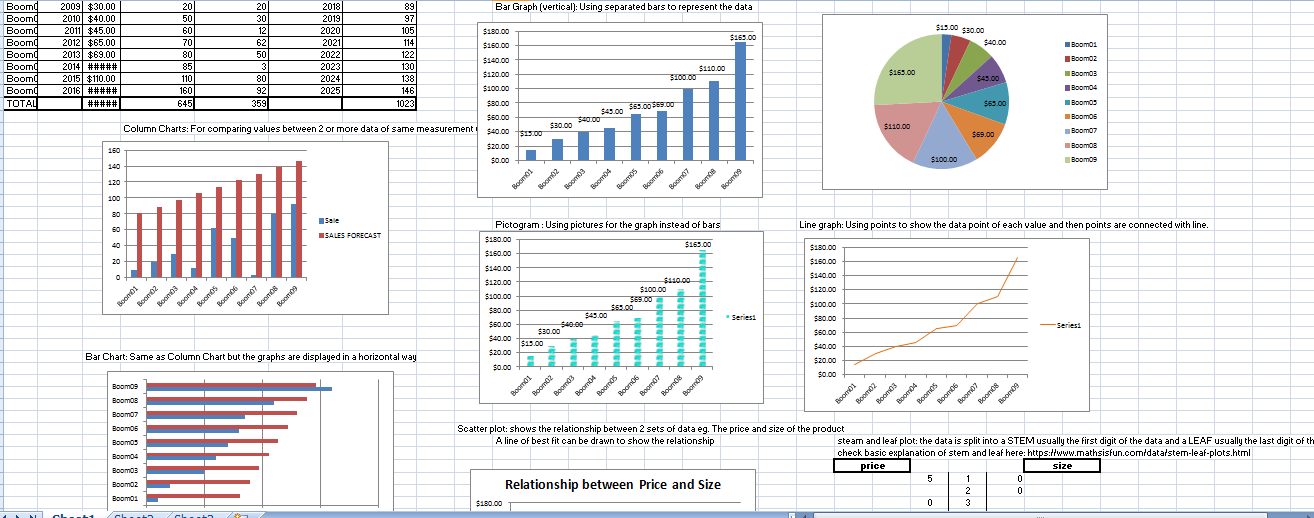
This is a quick look at some charts which are available and their names:
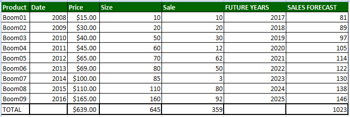
We use this raw data in the table below for references:
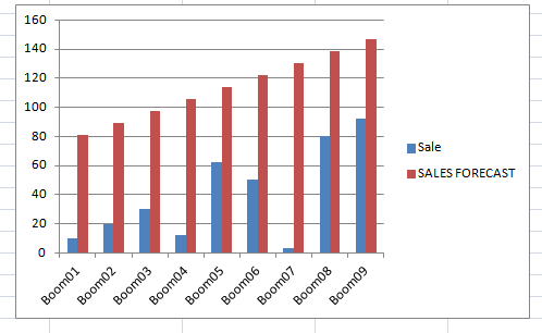
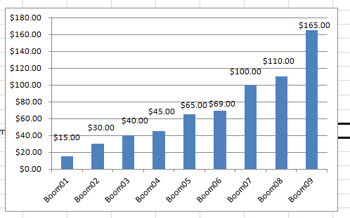
- Column Chart:
For comparing values between 2 or more data of same measurement unit and are of comparable sizes. Also it is ideal when the data categories are not too many because when they are too many the bars get clustered together.
Column chart 1
Column chart 2
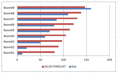
2. Bar Chart:
Same as Column Chart but the graphs are displayed in a horizontal way. Very ideal when the data labels on the horizontal axis are too long (so you put them on the vertical axis instead). Again, it is ideal when the data categories are not too many because when they are too many you usually get the bars get clustered together.
3. Pictogram : Using pictures for the graph instead of bars 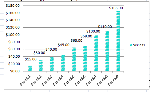
4. Pie Chart: Using Circles to represent values of the data. It is ideal to show composition of data. 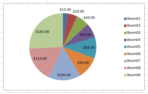
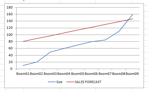
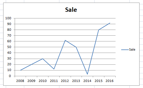
5. Line graph: Using points to show the data point of each value and then the points are connected with line. Ideal for comparison between 2 or more sets of data that have so many data points (large data set. ) It is also good for showing trend
Line chart 1
Line chart 2
6. Steam And Leaf Plot: The data is split into a STEM usually the first digit of the data value and a LEAF usually the last digit of the data value. Let’s use our data to plot a stem and leaf plot. Ideal for small set of data 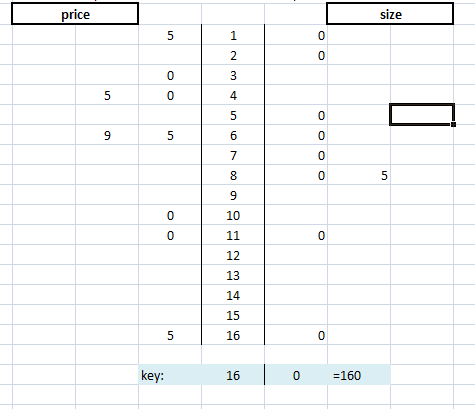
7. Scatter plot: Shows the relationship between 2 sets of data eg. The price and size of the product. A line of best fit can be drawn to show the relationship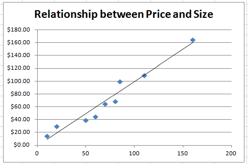
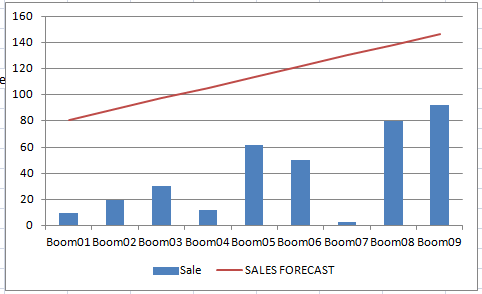
8. Combination Chart: It is a combination of 2 charts eg Column Chart and Line Chart. Very ideal for comparing 2 or data sets that have different unit measurements or different sizes
Combination chart 1
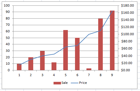
Combination chart 2
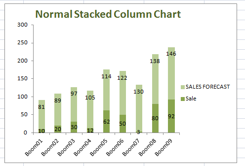
9. Stacked Column Chart: It is more like a column PIE CHART. It shows you how the various data values constitute of the entire data set. Units of measurement are usually the same
Stacked Column Chart 1
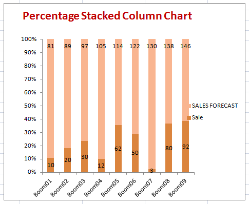
Percentage Stacked Column Chart
10. Stacked Area Charts: Very ideal for showing trend and at the same time showing the composition of the trend 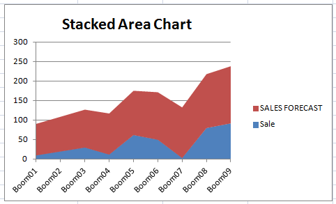
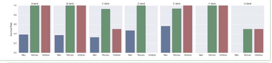
11. factorplot. This is from the Python seaborn library and it is ideal for plotting categorical data. Both the y-values (response) and x-values (explanatory) can all be categorical or either can be. You can use the col, argument to further split the plot into sub categories and you can use the size and aspect arguments to render the size of the plots
Example code :
|
1 2 3 4 5 6 7 8 9 10 11 12 |
import seaborn as sns %matplotlib inline titanic = sns.load_dataset("titanic") g = sns.factorplot(x="who", y="survived", col="deck", data=titanic, saturation=.5, kind="bar", ci=None, size = 4, aspect=.6) (g.set_axis_labels("", "Survival Rate") .set_xticklabels(["Men", "Women", "Children"]) .set_titles("{col_name} {col_var}") .set(ylim=(0, 1)) .despine(left=True)) |
You can download the Excel Worksheet with all these Data Charts and Notes here
Resources for further reading:
Stem and Leaf graph: link
Chart Suggestion: A guide to choosing the right chart. link
Charts infographic: link
Chart chooser: For choosing charts based on your need. link
Further reading 5 : link
Which chart or graph is right for you? : By Tableau

Incredible that is brilliant hope i can too get it working.