Python Pandas Pivot Table Index location Percentage calculation on Two columns – XlsxWriter pt2
This is a just a bit of addition to a previous post, by formatting the Excel output further using the Python XlsxWriter package.
The additions are :
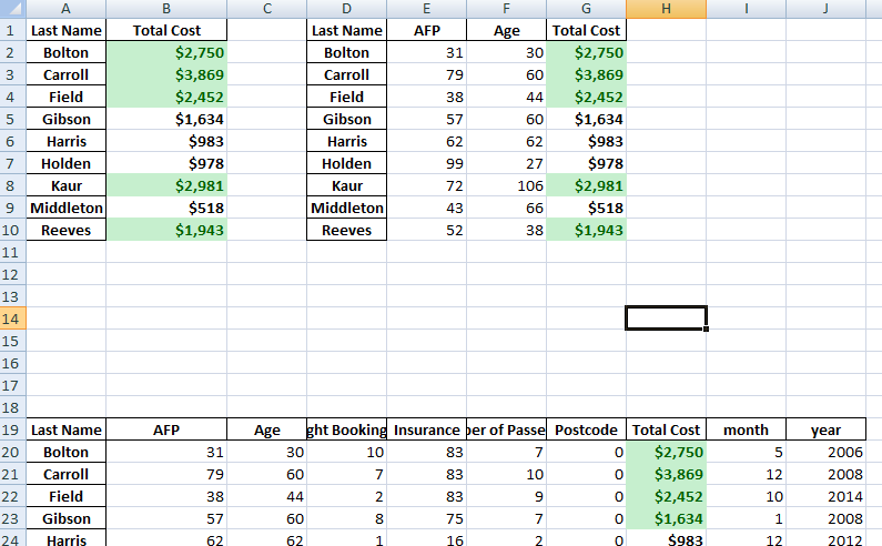
- Colour formatting has been added to the Total Cost column
- The “Total Cost” has been given a money formatting
- The above uses row : column numeric values instead of cell referencing
- Writing a static text or group of text at the bottom of the report generation and formatting it.Visualization Dashboard
|
1 2 3 4 5 6 |
import sqlalchemy import pyodbc from pandas import DataFrame from bokeh.plotting import figure, output_file, show import pandas as pd from xlsxwriter.utility import xl_rowcol_to_cell |
|
1 2 3 4 5 6 7 8 9 10 11 12 13 14 15 16 17 18 19 20 21 22 |
df = DataFrame ## connect to SqlServer Database and get information. try: import urllib params = urllib.quote_plus("DRIVER={SQL Server Native Client 11.0};SERVER=.\MSSQLSERVER_ENT;DATABASE=Antrak;Trusted_Connection=yes;") engine = sqlalchemy.create_engine('mssql+pyodbc:///?odbc_connect=%s"' % params) resoverall = engine.execute("SELECT top 10 * FROM FlightBookingsMain") df = df(resoverall.fetchall()) df.columns = resoverall.keys() except (RuntimeError, TypeError, NameError): print('Error in Conneccting') print(RuntimeError, TypeError, NameError) finally: print("connected") |
|
1 2 |
#lets look at the head of the dataframe df.head() |
|
1 2 3 |
#lets define the bokeh figure, and declare the x axis as type datetime p = figure(width=800, height=350, x_axis_type="datetime") |
In [115]:
|
1 2 3 |
#lots plot both a circle and line graph p.circle(df['Booking Date'], df['AFP'], size=4, color='darkgrey', alpha=0.2, legend='close') p.line(df['Booking Date'], df['Total Cost'], color='navy', legend='avg') |
|
1 2 3 |
# show the results #output_file('linegraph.html') show(p) |
|
1 2 3 4 5 6 7 8 9 10 11 |
# bokeh server plotting #sample server plotting code from bokeh #from bokeh.plotting import figure, show, output_server #p = figure(title="Server Plot") #p.circle([1, 2, 3], [4, 5, 6]) #output_server("hover") #show(p) |
I came across this brilliant analyis by pbpython. and decided to play around with it on this data. you can see the full code and explanation on his website: http://pbpython.com/pandas-pivot-table-explained.html. To I have added just a little bit of some extra exploration, the key and major analysis are from pbpython so you can check him out.
For convenience sake, let’s define the SEX column as a category and set the order we want to view.
This isn’t strictly required but helps us keep the order we want as we work through analyzing the data.
|
1 2 |
df['Sex'] = df['Sex'].astype('category') df['Sex'].cat.set_categories(['m','f'], inplace=True) |
The simplest pivot table must have a dataframe and an index . In this case, let’s use the Name as our index.
|
1 |
df['Booking Date'] = pd.to_datetime(df['Booking Date']) |
|
1 2 3 |
#get year from date df['year'] = df['Booking Date'].apply(lambda x: x.year) |
|
1 2 3 |
#get month from date df['month'] = df['Booking Date'].apply(lambda x: x.month) |
|
1 |
df.head() |
|
1 2 |
#get all data less than a particular date df[df['Booking Date']<'2014-10-28'] |
|
1 2 |
year_plot = pd.pivot_table(df, index=['year']) year_plot |
|
1 2 3 |
p.line(df['year'], df['Total Cost'], color='darkgrey', alpha=0.2, legend='year plot') output_file('linegraph.html') show(p) |
|
1 |
pv_result = pd.pivot_table(df, index=['Last Name']) |
|
1 2 |
type(pv_result) pv_result |
You can have multiple indexes as well. In fact, most of the pivot_table args can take multiple values via a list.
|
1 |
pd.pivot_table(df, index=['Last Name','Booking Date','Departure Date']) |
For this purpose, the Flight Booking ID, Insurance and Postcode columns aren’t really useful. Let’s remove it by explicitly defining the columns we care about using the values field.
|
1 |
#let |
|
1 2 |
sum_all =pd.pivot_table(df, index=['Last Name'], values=['Total Cost','AFP','Age'], aggfunc= np.sum) sum_all |
The price column automatically averages the data but we can do a count or a sum. Adding them is simple using aggfunc and np.sum .
|
1 2 |
ttlcost = pd.pivot_table(df, index=['Last Name'], values=['Total Cost'], aggfunc=np.sum) ttlcost |
aggfunc can take a list of functions. Let’s try a mean using the numpy mean function and len to get a count.
|
1 2 |
len_sum = pd.pivot_table(df, index=['Last Name'], values=['Total Cost'], aggfunc =[np.sum,len]) len_sum |
I think one of the confusing points with the pivot_table is the use of columns and values . Remember, columns are optional – they provide an additional way to segment the actual values you care about. The aggregation functions are applied to the values you list.
|
1 2 3 4 5 6 7 8 9 10 11 12 13 14 15 16 17 18 19 20 21 22 23 24 25 26 27 28 29 30 31 32 33 34 35 36 37 38 39 40 41 42 43 44 45 46 47 48 49 50 51 52 53 54 55 56 57 58 59 60 61 62 63 64 65 66 67 68 69 70 71 72 73 74 75 76 77 78 79 80 81 82 83 84 85 86 87 88 89 90 91 92 93 94 95 96 97 98 99 100 101 102 103 104 105 106 107 108 109 110 111 112 113 114 115 116 117 118 119 120 121 122 123 124 125 126 127 128 129 130 131 |
# function to put dataframe on same worksheet # 2 frames per line #format1 = workbook.add_format() def multiple_dfsUp(df_list, sheets, file_name, spaces): writer = pd.ExcelWriter(file_name,engine='xlsxwriter') row = 0 # for row to insert data at in the excel col = 0 # for columns to insert data at in the excel rowtostart = 0 increase = 0 #incrementer number_rows = 0 # total number of rows / length for the dataframe old_length = 0 # the last row/column pair where last insert / formatting was done for dataframe in df_list: if(increase%2==0): row = rowtostart col = 0 rowtostart = rowtostart- 4 ttlcost_pos = 0 old_position =0 # last position where totalcost was located dataframe.to_excel(writer,sheet_name=sheets,startrow=row , startcol=col) number_rows = len(dataframe.index) #total rows length for the current dataframe workbook = writer.book worksheet = writer.sheets[sheets] #get access to the sheets #Add a number format for cells with money money_fmt = workbook.add_format({'num_format':'$#,##0','bold':True}) #Add a percent a format with 1 decimal point percent_fmt = workbook.add_format({'num_format':'0.0%','bold':True}) format2 = workbook.add_format({'bg_color': '#C6EFCE', 'font_color': '#006100'}) #get index position for total cost ttlcost_pos = dataframe.columns.get_loc("Total Cost") + ttlcost_pos +1 #get the count of rows #for column in range(len(dataframe.columns)): #print('dataframe INNER ',column) #cell location #print('DATAFRAME ', dataframe) start_range = xl_rowcol_to_cell(row+1, ttlcost_pos) #print('START range ', increase, start_range) #debugging #print('START row number ', increase, row) #debugging #print('START ttlcost_pos ', increase, ttlcost_pos) #debugging end_range = xl_rowcol_to_cell(number_rows+row, ttlcost_pos) #print('END range ',increase, end_range)#debugging ttlcost_range = start_range + ":" + end_range ttlcost_color_range = ttlcost_range #print('TOTAL RANGE ', increase, ttlcost_range) #debugging #apply money formatting to total cost worksheet.conditional_format(ttlcost_range, {'type': 'cell', 'criteria': '>', 'value': 0, 'format': money_fmt}) # Highlight the top 5 values in Green worksheet.conditional_format(ttlcost_color_range, {'type': 'top', 'value': '5', 'format': format2}) col = col + len(dataframe.columns) + spaces + 1 rowtostart = rowtostart + len(dataframe.index) + spaces + 1 increase = increase + 1 #print('length of df',len(dataframe.columns)) #debugging if(ttlcost_pos>=len(dataframe.columns)-1): #ttlcost_pos = ttlcost_pos + spaces + 1 ttlcost_pos = old_position +len(dataframe.columns) + spaces + 1 else: ttlcost_pos = len(dataframe.columns) + spaces + 1 old_position = ttlcost_pos # old position to hold from datetime import datetime import xlsxwriter bold = workbook.add_format({'bold': 1}) # Write some data headers. worksheet.write('A31', 'Item', bold) worksheet.write('B31', 'Date', bold) worksheet.write('C31', 'Cost', bold) # Add an Excel date format. date_format = workbook.add_format({'num_format': 'mmmm d yyyy'}) expenses = ( ['Rent', '2013-01-13', 1000], ['Gas', '2013-01-14', 100], ['Food', '2013-01-16', 300], ['Gym', '2013-01-20', 50], ) row = 31 col = 0 for item, date_str, cost in (expenses): # Convert the date string into a datetime object. date = datetime.strptime(date_str, "%Y-%m-%d") worksheet.write_string (row, col, item ) worksheet.write_datetime(row, col + 1, date, date_format ) worksheet.write_number (row, col + 2, cost, money_fmt) row += 1 # Write a total using a formula. worksheet.write(row, 0, 'Total', bold) worksheet.write(row, 2, '=SUM(C32:C35)', money_fmt) chart = workbook.add_chart({'type': 'column'}) writer.save() # list of dataframes |
|
1 2 |
dfs = [ttlcost,sum_all, pv_result, year_plot] multiple_dfsUp(dfs, 'report', 'test1.xlsx', 1) |
|
1 |
pv_result.to_html('filename.html') |
note.
the index in the dataframe is not counted as part of the rows in excel when you visualize in excel. hence if you have one index and though it appears like there are 2 rows in excel when you view it, the first column is only the “index” and actually only one single column is counted
People Who Read The Above Post Also Read This:
 Python Pandas Pivot Table Index location Percentage calculation on Two columns
Python Bokeh plotting Data Exploration Visualization And Pivot Tables Analysis
Save Python Pivot Table in Excel Sheets ExcelWriter
Save Multiple Pandas DataFrames to One Single Excel Sheet Side by Side or Dowwards – XlsxWriter
Python Pandas Pivot Table Index location Percentage calculation on Two columns
Python Bokeh plotting Data Exploration Visualization And Pivot Tables Analysis
Save Python Pivot Table in Excel Sheets ExcelWriter
Save Multiple Pandas DataFrames to One Single Excel Sheet Side by Side or Dowwards – XlsxWriter