Python Pandas Groupby function agg Series GroupbyObject
Group By FunctionThis is a quick look at Python groupby function. Very powerful and useful function. We will take a simple look at it here.
Credits to Data School , creator of Python course materials.
lets import sample dataset
|
1 |
import pandas as pd |
|
1 |
drinks = pd.read_csv('http://bit.ly/drinksbycountry') |
|
1 2 |
#lets check the head drinks.head() |
| country | beer_servings | spirit_servings | wine_servings | total_litres_of_pure_alcohol | continent | |
|---|---|---|---|---|---|---|
| 0 | Afghanistan | 0 | 0 | 0 | 0.0 | Asia |
| 1 | Albania | 89 | 132 | 54 | 4.9 | Europe |
| 2 | Algeria | 25 | 0 | 14 | 0.7 | Africa |
| 3 | Andorra | 245 | 138 | 312 | 12.4 | Europe |
| 4 | Angola | 217 | 57 | 45 | 5.9 | Africa |
What is the average beer servings across ALL countries
|
1 |
drinks.beer_servings.mean() |
|
1 |
106.16062176165804 |
|
1 |
drinks['beer_servings'].mean() |
|
1 |
106.16062176165804 |
|
1 |
What is the average beer servings by continents? |
|
1 |
Object `continents` not found. |
|
1 |
What is the average beer servings by continents |
What is the average beer servings by continents
|
1 |
drinks.groupby('continent').beer_servings.mean() |
|
1 2 3 4 5 6 7 8 |
continent Africa 61.471698 Asia 37.045455 Europe 193.777778 North America 145.434783 Oceania 89.687500 South America 175.083333 Name: beer_servings, dtype: float64 |
lets filter the drinks by only one continent, eg Africa and then get its mean
|
1 |
drinks[drinks.continent=='Africa'].beer_servings.mean() |
|
1 |
61.471698113207545 |
lets find the maximum beer_serving by continent
|
1 |
drinks.groupby('continent').beer_servings.max() |
|
1 2 3 4 5 6 7 8 |
continent Africa 376 Asia 247 Europe 361 North America 285 Oceania 306 South America 333 Name: beer_servings, dtype: int64 |
there is a powerful ‘agg’ function which allows us to specifiy multiply functions at one time , by passing the functions as a list to the agg function
|
1 |
drinks.groupby('continent').beer_servings.agg(['count','min', 'max','mean']) |
| count | min | max | mean | |
|---|---|---|---|---|
| continent | ||||
| Africa | 53 | 0 | 376 | 61.471698 |
| Asia | 44 | 0 | 247 | 37.045455 |
| Europe | 45 | 0 | 361 | 193.777778 |
| North America | 23 | 1 | 285 | 145.434783 |
| Oceania | 16 | 0 | 306 | 89.687500 |
| South America | 12 | 93 | 333 | 175.083333 |
You can also make calculations across all the numerical columns at one time by not selecting any specific column to use for calculation.
|
1 |
drinks.groupby('continent').mean() |
| beer_servings | spirit_servings | wine_servings | total_litres_of_pure_alcohol | |
|---|---|---|---|---|
| continent | ||||
| Africa | 61.471698 | 16.339623 | 16.264151 | 3.007547 |
| Asia | 37.045455 | 60.840909 | 9.068182 | 2.170455 |
| Europe | 193.777778 | 132.555556 | 142.222222 | 8.617778 |
| North America | 145.434783 | 165.739130 | 24.521739 | 5.995652 |
| Oceania | 89.687500 | 58.437500 | 35.625000 | 3.381250 |
| South America | 175.083333 | 114.750000 | 62.416667 | 6.308333 |
We can visualize the information in a simple plot
|
1 2 |
%matplotlib inline drinks.groupby('continent').mean().plot(kind='bar') |
|
1 |
<matplotlib.axes._subplots.AxesSubplot at 0x9a93ba8> |

You can also retrieven how many instances of each continent is seen.
|
1 |
drinks.groupby('continent').size() |
|
1 2 3 4 5 6 7 8 |
continent Africa 53 Asia 44 Europe 45 North America 23 Oceania 16 South America 12 dtype: int64 |
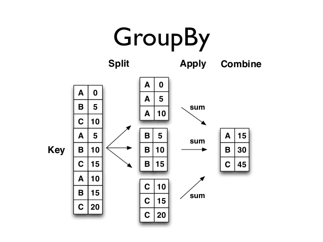
Group By SPLITS the dataframe into a group of objects which each has their own keys. Functions can then be applied to each indivicual
split object, a group of these split objects or all of these split objects as groups.
We can run analysis and afterwards combine these split object back into a dataframe!
lets create a groupyby object
|
1 |
grouped = drinks.groupby('continent') |
lets check the type
|
1 |
type(grouped) |
|
1 |
pandas.core.groupby.DataFrameGroupBy |
The groupby object is iteratable and the split objects (groups of groupbydataframe objects) from the grougpby function has their repective keys / index.
Lets iterate through this grouped object
|
1 2 3 |
for k , group in grouped: print(k) print(group) |
|
1 2 3 4 5 6 7 8 9 10 11 12 13 14 15 16 17 18 19 20 21 22 23 24 25 26 27 28 29 30 31 32 33 34 35 36 37 38 39 40 41 42 43 44 45 46 47 48 49 50 51 52 53 54 55 56 57 58 59 60 61 62 63 64 65 66 67 68 69 70 71 72 73 74 75 76 77 78 79 80 81 82 83 84 85 86 87 88 89 90 91 92 93 94 95 96 97 98 99 100 101 102 103 104 105 106 107 108 109 110 111 112 113 114 115 116 117 118 119 120 121 122 123 124 125 126 127 128 129 130 131 132 133 134 135 136 137 138 139 140 141 142 143 144 145 146 147 148 149 150 151 152 153 154 155 156 157 158 159 160 161 162 163 164 165 166 167 168 169 170 171 172 173 174 175 176 177 178 179 180 181 182 183 184 185 186 187 188 189 190 191 192 193 194 195 196 197 198 199 200 201 202 203 204 205 206 207 208 209 210 211 212 213 214 215 216 217 218 219 220 221 222 223 224 225 226 227 228 229 230 231 232 233 234 235 236 237 238 239 240 241 242 243 244 245 246 247 248 249 250 251 252 253 254 255 256 257 258 259 260 261 262 263 264 265 266 267 268 269 270 271 272 273 274 275 276 277 278 279 280 281 282 283 284 285 286 287 288 289 290 291 292 293 294 295 296 297 298 299 300 301 302 303 304 305 306 307 308 309 310 311 312 313 314 315 316 317 318 319 320 321 322 323 324 325 326 327 328 329 330 331 332 333 334 335 336 337 338 339 340 341 342 343 344 345 346 347 348 349 350 351 352 353 354 355 356 357 358 359 360 361 362 363 364 365 366 367 368 369 370 371 372 373 374 375 376 377 378 379 380 381 382 383 384 385 386 387 388 389 390 391 392 393 394 395 396 397 398 399 400 401 402 403 404 405 406 407 408 409 410 |
Africa country beer_servings spirit_servings wine_servings \ 2 Algeria 25 0 14 4 Angola 217 57 45 18 Benin 34 4 13 22 Botswana 173 35 35 26 Burkina Faso 25 7 7 27 Burundi 88 0 0 28 Cote d'Ivoire 37 1 7 29 Cabo Verde 144 56 16 31 Cameroon 147 1 4 33 Central African Republic 17 2 1 34 Chad 15 1 1 38 Comoros 1 3 1 39 Congo 76 1 9 47 DR Congo 32 3 1 49 Djibouti 15 44 3 53 Egypt 6 4 1 55 Equatorial Guinea 92 0 233 56 Eritrea 18 0 0 58 Ethiopia 20 3 0 62 Gabon 347 98 59 63 Gambia 8 0 1 66 Ghana 31 3 10 70 Guinea 9 0 2 71 Guinea-Bissau 28 31 21 88 Kenya 58 22 2 95 Lesotho 82 29 0 96 Liberia 19 152 2 97 Libya 0 0 0 100 Madagascar 26 15 4 101 Malawi 8 11 1 104 Mali 5 1 1 107 Mauritania 0 0 0 108 Mauritius 98 31 18 114 Morocco 12 6 10 115 Mozambique 47 18 5 117 Namibia 376 3 1 123 Niger 3 2 1 124 Nigeria 42 5 2 142 Rwanda 43 2 0 148 Sao Tome & Principe 56 38 140 150 Senegal 9 1 7 152 Seychelles 157 25 51 153 Sierra Leone 25 3 2 158 Somalia 0 0 0 159 South Africa 225 76 81 162 Sudan 8 13 0 164 Swaziland 90 2 2 172 Togo 36 2 19 175 Tunisia 51 3 20 179 Uganda 45 9 0 183 Tanzania 36 6 1 191 Zambia 32 19 4 192 Zimbabwe 64 18 4 total_litres_of_pure_alcohol continent 2 0.7 Africa 4 5.9 Africa 18 1.1 Africa 22 5.4 Africa 26 4.3 Africa 27 6.3 Africa 28 4.0 Africa 29 4.0 Africa 31 5.8 Africa 33 1.8 Africa 34 0.4 Africa 38 0.1 Africa 39 1.7 Africa 47 2.3 Africa 49 1.1 Africa 53 0.2 Africa 55 5.8 Africa 56 0.5 Africa 58 0.7 Africa 62 8.9 Africa 63 2.4 Africa 66 1.8 Africa 70 0.2 Africa 71 2.5 Africa 88 1.8 Africa 95 2.8 Africa 96 3.1 Africa 97 0.0 Africa 100 0.8 Africa 101 1.5 Africa 104 0.6 Africa 107 0.0 Africa 108 2.6 Africa 114 0.5 Africa 115 1.3 Africa 117 6.8 Africa 123 0.1 Africa 124 9.1 Africa 142 6.8 Africa 148 4.2 Africa 150 0.3 Africa 152 4.1 Africa 153 6.7 Africa 158 0.0 Africa 159 8.2 Africa 162 1.7 Africa 164 4.7 Africa 172 1.3 Africa 175 1.3 Africa 179 8.3 Africa 183 5.7 Africa 191 2.5 Africa 192 4.7 Africa Asia country beer_servings spirit_servings wine_servings \ 0 Afghanistan 0 0 0 12 Bahrain 42 63 7 13 Bangladesh 0 0 0 19 Bhutan 23 0 0 24 Brunei 31 2 1 30 Cambodia 57 65 1 36 China 79 192 8 46 North Korea 0 0 0 77 India 9 114 0 78 Indonesia 5 1 0 79 Iran 0 0 0 80 Iraq 9 3 0 82 Israel 63 69 9 85 Japan 77 202 16 86 Jordan 6 21 1 87 Kazakhstan 124 246 12 90 Kuwait 0 0 0 91 Kyrgyzstan 31 97 6 92 Laos 62 0 123 94 Lebanon 20 55 31 102 Malaysia 13 4 0 103 Maldives 0 0 0 112 Mongolia 77 189 8 116 Myanmar 5 1 0 119 Nepal 5 6 0 127 Oman 22 16 1 128 Pakistan 0 0 0 134 Philippines 71 186 1 137 Qatar 1 42 7 138 South Korea 140 16 9 141 Russian Federation 247 326 73 149 Saudi Arabia 0 5 0 154 Singapore 60 12 11 161 Sri Lanka 16 104 0 167 Syria 5 35 16 168 Tajikistan 2 15 0 169 Thailand 99 258 1 171 Timor-Leste 1 1 4 176 Turkey 51 22 7 177 Turkmenistan 19 71 32 181 United Arab Emirates 16 135 5 186 Uzbekistan 25 101 8 189 Vietnam 111 2 1 190 Yemen 6 0 0 total_litres_of_pure_alcohol continent 0 0.0 Asia 12 2.0 Asia 13 0.0 Asia 19 0.4 Asia 24 0.6 Asia 30 2.2 Asia 36 5.0 Asia 46 0.0 Asia 77 2.2 Asia 78 0.1 Asia 79 0.0 Asia 80 0.2 Asia 82 2.5 Asia 85 7.0 Asia 86 0.5 Asia 87 6.8 Asia 90 0.0 Asia 91 2.4 Asia 92 6.2 Asia 94 1.9 Asia 102 0.3 Asia 103 0.0 Asia 112 4.9 Asia 116 0.1 Asia 119 0.2 Asia 127 0.7 Asia 128 0.0 Asia 134 4.6 Asia 137 0.9 Asia 138 9.8 Asia 141 11.5 Asia 149 0.1 Asia 154 1.5 Asia 161 2.2 Asia 167 1.0 Asia 168 0.3 Asia 169 6.4 Asia 171 0.1 Asia 176 1.4 Asia 177 2.2 Asia 181 2.8 Asia 186 2.4 Asia 189 2.0 Asia 190 0.1 Asia Europe country beer_servings spirit_servings wine_servings \ 1 Albania 89 132 54 3 Andorra 245 138 312 7 Armenia 21 179 11 9 Austria 279 75 191 10 Azerbaijan 21 46 5 15 Belarus 142 373 42 16 Belgium 295 84 212 21 Bosnia-Herzegovina 76 173 8 25 Bulgaria 231 252 94 42 Croatia 230 87 254 44 Cyprus 192 154 113 45 Czech Republic 361 170 134 48 Denmark 224 81 278 57 Estonia 224 194 59 60 Finland 263 133 97 61 France 127 151 370 64 Georgia 52 100 149 65 Germany 346 117 175 67 Greece 133 112 218 75 Hungary 234 215 185 76 Iceland 233 61 78 81 Ireland 313 118 165 83 Italy 85 42 237 93 Latvia 281 216 62 98 Lithuania 343 244 56 99 Luxembourg 236 133 271 105 Malta 149 100 120 111 Monaco 0 0 0 113 Montenegro 31 114 128 120 Netherlands 251 88 190 126 Norway 169 71 129 135 Poland 343 215 56 136 Portugal 194 67 339 139 Moldova 109 226 18 140 Romania 297 122 167 147 San Marino 0 0 0 151 Serbia 283 131 127 155 Slovakia 196 293 116 156 Slovenia 270 51 276 160 Spain 284 157 112 165 Sweden 152 60 186 166 Switzerland 185 100 280 170 Macedonia 106 27 86 180 Ukraine 206 237 45 182 United Kingdom 219 126 195 total_litres_of_pure_alcohol continent 1 4.9 Europe 3 12.4 Europe 7 3.8 Europe 9 9.7 Europe 10 1.3 Europe 15 14.4 Europe 16 10.5 Europe 21 4.6 Europe 25 10.3 Europe 42 10.2 Europe 44 8.2 Europe 45 11.8 Europe 48 10.4 Europe 57 9.5 Europe 60 10.0 Europe 61 11.8 Europe 64 5.4 Europe 65 11.3 Europe 67 8.3 Europe 75 11.3 Europe 76 6.6 Europe 81 11.4 Europe 83 6.5 Europe 93 10.5 Europe 98 12.9 Europe 99 11.4 Europe 105 6.6 Europe 111 0.0 Europe 113 4.9 Europe 120 9.4 Europe 126 6.7 Europe 135 10.9 Europe 136 11.0 Europe 139 6.3 Europe 140 10.4 Europe 147 0.0 Europe 151 9.6 Europe 155 11.4 Europe 156 10.6 Europe 160 10.0 Europe 165 7.2 Europe 166 10.2 Europe 170 3.9 Europe 180 8.9 Europe 182 10.4 Europe North America country beer_servings spirit_servings \ 5 Antigua & Barbuda 102 128 11 Bahamas 122 176 14 Barbados 143 173 17 Belize 263 114 32 Canada 240 122 41 Costa Rica 149 87 43 Cuba 93 137 50 Dominica 52 286 51 Dominican Republic 193 147 54 El Salvador 52 69 68 Grenada 199 438 69 Guatemala 53 69 73 Haiti 1 326 74 Honduras 69 98 84 Jamaica 82 97 109 Mexico 238 68 122 Nicaragua 78 118 130 Panama 285 104 143 St. Kitts & Nevis 194 205 144 St. Lucia 171 315 145 St. Vincent & the Grenadines 120 221 174 Trinidad & Tobago 197 156 184 USA 249 158 wine_servings total_litres_of_pure_alcohol continent 5 45 4.9 North America 11 51 6.3 North America 14 36 6.3 North America 17 8 6.8 North America 32 100 8.2 North America 41 11 4.4 North America 43 5 4.2 North America 50 26 6.6 North America 51 9 6.2 North America 54 2 2.2 North America 68 28 11.9 North America 69 2 2.2 North America 73 1 5.9 North America 74 2 3.0 North America 84 9 3.4 North America 109 5 5.5 North America 122 1 3.5 North America 130 18 7.2 North America 143 32 7.7 North America 144 71 10.1 North America 145 11 6.3 North America 174 7 6.4 North America 184 84 8.7 North America Oceania country beer_servings spirit_servings wine_servings \ 8 Australia 261 72 212 40 Cook Islands 0 254 74 59 Fiji 77 35 1 89 Kiribati 21 34 1 106 Marshall Islands 0 0 0 110 Micronesia 62 50 18 118 Nauru 49 0 8 121 New Zealand 203 79 175 125 Niue 188 200 7 129 Palau 306 63 23 131 Papua New Guinea 44 39 1 146 Samoa 105 18 24 157 Solomon Islands 56 11 1 173 Tonga 36 21 5 178 Tuvalu 6 41 9 187 Vanuatu 21 18 11 total_litres_of_pure_alcohol continent 8 10.4 Oceania 40 5.9 Oceania 59 2.0 Oceania 89 1.0 Oceania 106 0.0 Oceania 110 2.3 Oceania 118 1.0 Oceania 121 9.3 Oceania 125 7.0 Oceania 129 6.9 Oceania 131 1.5 Oceania 146 2.6 Oceania 157 1.2 Oceania 173 1.1 Oceania 178 1.0 Oceania 187 0.9 Oceania South America country beer_servings spirit_servings wine_servings \ 6 Argentina 193 25 221 20 Bolivia 167 41 8 23 Brazil 245 145 16 35 Chile 130 124 172 37 Colombia 159 76 3 52 Ecuador 162 74 3 72 Guyana 93 302 1 132 Paraguay 213 117 74 133 Peru 163 160 21 163 Suriname 128 178 7 185 Uruguay 115 35 220 188 Venezuela 333 100 3 total_litres_of_pure_alcohol continent 6 8.3 South America 20 3.8 South America 23 7.2 South America 35 7.6 South America 37 4.2 South America 52 4.2 South America 72 7.1 South America 132 7.3 South America 133 6.1 South America 163 5.6 South America 185 6.6 South America 188 7.7 South America |