Running a Classification Tree – Decision Tree – Data Analysis and Intrepretation
Overview
My research work deals with Ghana, a country from the Gapminder dataset as has already been discussed from the beginning and progression through this course.
Picture
Of My Final Decision Tree Outputted From My Python Program

The variables in my observation dataset
are all quantitative.
For the purposes of this assignment, I have binned my quantitative target variable, Life Expectancy (lifeexpectancy) into a 2-level binary categorical target variable. I have named this categorical target variable, lifeExpectancyCat. It has been coded as 0 = low life expectancy and 1 = high life expectancy
I have also binned all the other predictor variables categorical variables for the purpose of this assignment.
Thus these are the respective categorical end result variables of my quantitative predictor variables:
Quantitative Binary Categorical variable
incomeperperson – incomeLevelGrp
inflation – inflationCatGrp
exports – exportsCatGrp
However, I have only used 2 of these variables, namely, incomeLevelGrp and exportsCatGrp predictor variables in classifying my tree.
Decision tree analysis was performed to test nonlinear relationships among my 2 explanatory variables and my binary, categorical response variable. All possible
separations (categorical) are tested.
From my decision, it first starts with a split on X[1] which is exportsCatGrp my
second explanatory variable. If the value for exportsCatGrp is less than 0.5, that is low exports as my exportsCatGrp has values of 0 = low exports and 1 = high exports, then the observation moves to the left side of the split and includes 28 of the 30 observations in the training sample.
From this node another split is made on incomeLevelGrp which is X[0] so that I have periods with low exports and high incomes and also periods with low exports and low income levels.
From the resulting leaf that has periods with low exports and high incomes, which shown to the right of the split from X[0], 7 of the people of Ghana have High Life Expectancy and 7 also have Low Life Expectancy.
From the resulting leaf that has periods with low exports and low incomes, 8 of the people of Ghana have High Life Expectancy and 6 have Low Life Expectancy.
However, if the value for exportsCatGrp, X[1] is greater than 0.5 that is high exports, then the observation moves to the right hand side of the split and
includes 2 of the 30 observations in the training sample.
From this, a decision tree leaf is created and from this leaf, 0 person(s), that is no one, has High Life Expectancy rate and 2 people have Low Life Expectancy.
Hence from the decision tree classification, periods with low exports and low incomes are more likely to have High Life Expectancy than periods of high exports and high income levels. (which is rather surprising!)
Requesting the shape of my predictor training sample it can be seen that it has 30 observation or rows which represents 60% of our original sample and 2 explanatory variables as indicated above.

The test sample has 21 observation or rows which is 40% of
the original sample and 2 explanatory variables or columns
A Confusion Matrix was used to estimate the prediction accuracy of my model. From the results of the Confusion Matrix, the models accurately classified 15 of the total 21 observations included in my data set for the classification and misclassified 6 of the 21 observations included in the classification process. This means the model correctly classified 71% of the observations as having High Life
Expectancy or Low Life Expectancy and misclassified 29% of the observations in
my data set.
The Confusion Matrix result can be seen below:
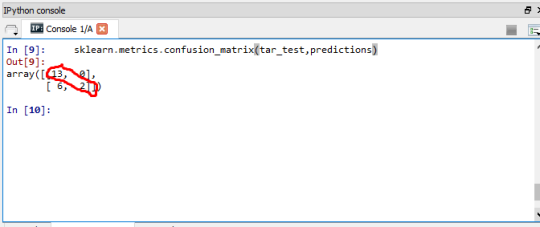
This can be interpreted as the model having low prediction error as it correctly classified high percentage of the observations and misclassified low percentage of the observations in my dataset
This can further be seen by running a Test Accuracy score on
my model and the result was 0.7142857142857143 (71%) as can also be seen below:

################################
PYTHON CODE
#################################
################################
CODE OUTPUT
#################################