Python Bokeh plotting Data Exploration Visualization And Pivot Tables Analysis
This is a quick walk through Bokeh data exploration and visualization and also python pivot_tables (credit to pbpython on the pivot_tables).Visualization Dashboard
|
1 2 3 4 5 |
import sqlalchemy import pyodbc from pandas import DataFrame from bokeh.plotting import figure, output_file, show import pandas as pd |
|
1 2 3 4 5 6 7 8 9 10 11 12 13 14 15 16 17 18 19 20 21 22 |
df = DataFrame ## connect to SqlServer Database and get information. try: import urllib params = urllib.quote_plus("DRIVER={SQL Server Native Client 11.0};SERVER=.\MSSQLSERVER_ENT;DATABASE=Antrak;Trusted_Connection=yes;") engine = sqlalchemy.create_engine('mssql+pyodbc:///?odbc_connect=%s"' % params) resoverall = engine.execute("SELECT top 10 * FROM FlightBookingsMain") df = df(resoverall.fetchall()) df.columns = resoverall.keys() except (RuntimeError, TypeError, NameError): print('Error in Conneccting') print(RuntimeError, TypeError, NameError) finally: print("connected") |
|
1 2 |
#lets look at the head of the dataframe df.head() |
|
1 2 3 |
#lets define the bokeh figure, and declare the x axis as type datetime p = figure(width=800, height=350, x_axis_type="datetime") |
|
1 2 3 |
#lots plot both a circle and line graph p.circle(df['Booking Date'], df['AFP'], size=4, color='darkgrey', alpha=0.2, legend='close') p.line(df['Booking Date'], df['Total Cost'], color='navy', legend='avg') |
|
1 2 3 |
# show the results output_file('linegraph.html') show(p) |
|
1 2 3 4 5 6 7 8 9 10 11 |
# bokeh server plotting #sample server plotting code from bokeh from bokeh.plotting import figure, show, output_server p = figure(title="Server Plot") p.circle([1, 2, 3], [4, 5, 6]) output_server("hover") show(p) |
I came across this brilliant analyis by pbpython. and decided to play around with it on this data. you can see the full code and explanation on his website: http://pbpython.com/pandas-pivot-table-explained.html. Though I have added just a little bit of some extra exploration, the key and major analysis are from pbpython so you can check him out.
For convenience sake, let’s define the SEX column as a category and set the order we want to view.
This isn’t strictly required but helps us keep the order we want as we work through analyzing the data.
|
1 2 |
df['Sex'] = df['Sex'].astype('category') df['Sex'].cat.set_categories(['m','f'], inplace=True) |
The simplest pivot table must have a dataframe and an index . In this case, let’s use the Name as our index.
|
1 |
df['Booking Date'] = pd.to_datetime(df['Booking Date']) |
|
1 2 3 |
#get year from date df['year'] = df['Booking Date'].apply(lambda x: x.year) |
|
1 2 3 |
#get month from date df['month'] = df['Booking Date'].apply(lambda x: x.month) |
|
1 |
df.head() |
|
1 2 |
#get all data less than a particular date df[df['Booking Date']<'2014-10-28'] |
|
1 2 |
year_plot = pd.pivot_table(df, index=['year']) year_plot |
|
1 2 3 |
p.line(df['year'], df['Total Cost'], color='darkgrey', alpha=0.2, legend='year plot') output_file('linegraph.html') show(p) |
|
1 |
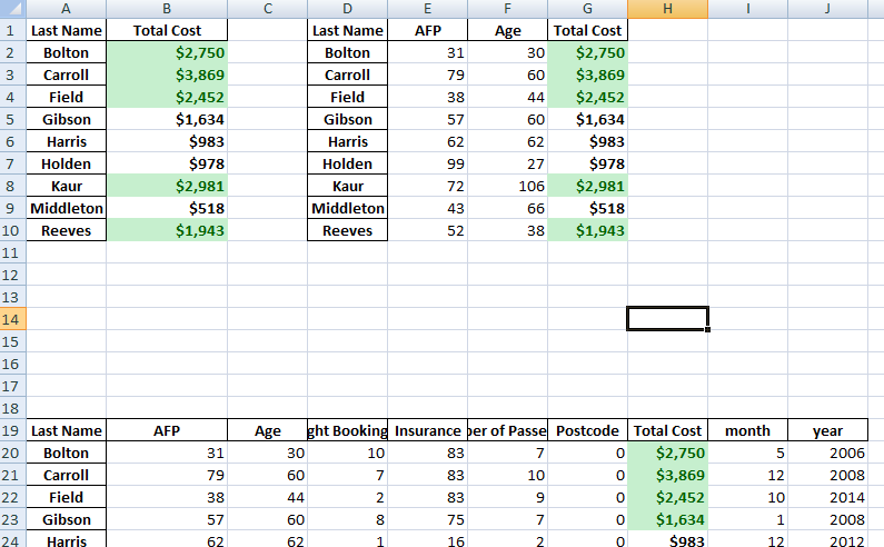
pv_result = pd.pivot_table(df, index=['Last Name']) |
|
1 2 |
type(pv_result) pv_result |
You can have multiple indexes as well. In fact, most of the pivot_table args can take multiple values via a list.
|
1 |
pd.pivot_table(df, index=['Last Name','Booking Date','Departure Date']) |
For this purpose, the Flight Booking ID, Insurance and Postcode columns aren’t really useful. Let’s remove it by explicitly defining the columns we care about using the values field.
|
1 |
pd.pivot_table(df, index=['Last Name'], values=['Total Cost']) |
The price column automatically averages the data but we can do a count or a sum. Adding them is simple using aggfunc and np.sum .
|
1 |
pd.pivot_table(df, index=['Last Name'], values=['Total Cost'], aggfunc=np.sum) |
aggfunc can take a list of functions. Let’s try a mean using the numpy mean function and len to get a count.
|
1 |
pd.pivot_table(df, index=['Last Name'], values=['Total Cost'], aggfunc =[np.sum,len]) |
I think one of the confusing points with the pivot_table is the use of columns and values . Remember, columns are optional – they provide an additional way to segment the actual values you care about. The aggregation functions are applied to the values you list.
People Who Read The Above Post Also Read This:
 Python Pandas Pivot Table Index location Percentage calculation on Two columns – XlsxWriter pt2
 Python Pandas Pivot Table Index location Percentage calculation on Two columns
Basic Plotting Using Bokeh Python Pandas Library – Scatter, Line Visualizations
Python Pandas Pivot Table Index location Percentage calculation on Two columns
Basic Plotting Using Bokeh Python Pandas Library – Scatter, Line Visualizations