Creating a Gantt Chart Graph In Excel
Let’s assume we have some simple goals we want to achieve.
Lets set our goals as follows:

We enter our goals / targets in column 1. We have to set up our table correctly to make the Gantt chart creation easier and straight forward for us.
- We enter our goals in column B
- In column C (Start Date), we start when each of the tasks will START.
- In column D (Days), we input the number of days, it will take us to complete the corresponding goal or target.
- In column E(End Date) we can use an excel function to fill them up. For instance, if we want to include only WORKDAYS, we can use the formula like =WORKDAY(C3,D3), which will exclude weekends and any days it recognises as holidays.
- In column F (Days In Total), we will just consider the total number of days from beginning date to end date which we can simply subtract start date from enddate (=E3-C3)
- Next we HOLD DOWN the CTRL KEY and select these data, GOALS, STARTDATE, AND DAYS IN TOTAL as highlighted below

7. Next go to INSERT tab and select BAR , and then select STACKED BAR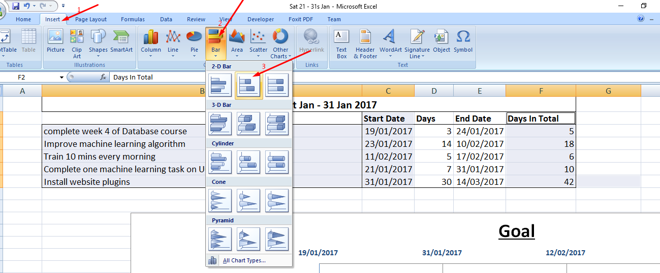
8. From the resulting graph which will be inserted, we want to remove the bars which are representing the days we don’t want hence click on one of the blue bars (representing days prior to the start of our goals) and then right click on one of the selected blue bars. 
9. From the pop up, select FILL and then select NO FILL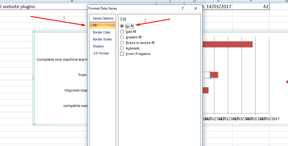
10. Then select BORDER COLOR and NO LINE 
11. Now the blue bars will be removed so we will have to format our dates. Before that hold down the CTRL key and click on the START DATE and END DATE and change them to Number format (it is temporary as we will reverse them back to dates). We will need these numbers in the next step.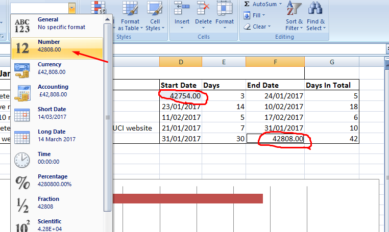
12. Now Right click on the dates at the bottom of the chart and select format axis. 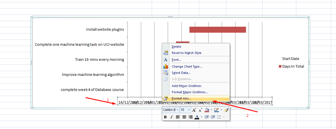
12. Now select the fixed options on the Minimum and Maximum options under Axis Options and enter the Start date value as minimum and end date value as maximum 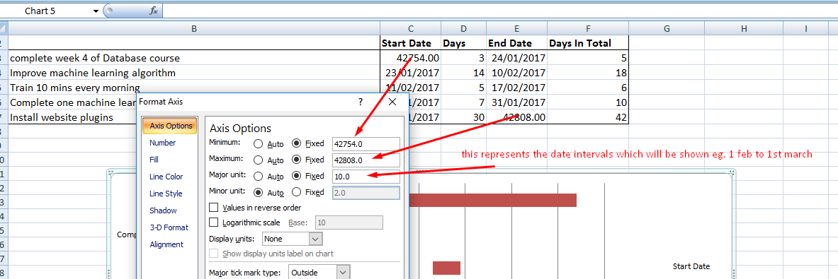
13.Close that box and now put the start and end dates back to Short Date format. 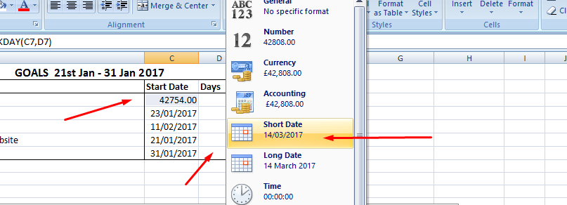
14. Now let’s do some tidying up. First let’s add the duration labels to our bars. Now right click on any of the bars and choose Add Data Labels 
15. Now let’s make the bars bigger and closer to each other. Now right click on any of the bars and choose Format Data Series. In the resulting window, under Series Options drag the No Gap bars to 0%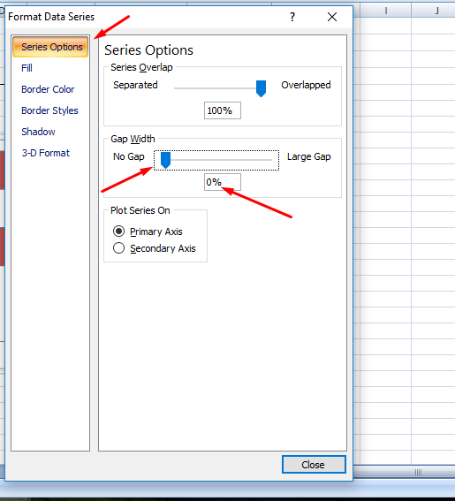
16. Now let’s make our goals/targets on the right hand side have the earliest-starting ones at the top. Right click on the goals in the chart and select Format axis and in the Axis Options select Categories in reverse order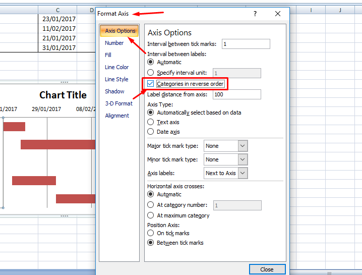
17. Now let’s put our goals and targets with duration beneath the chart. Click on the chart and go to the DESIGN TAB and choose the design you want. We will choose the design which will put the details beneath the chart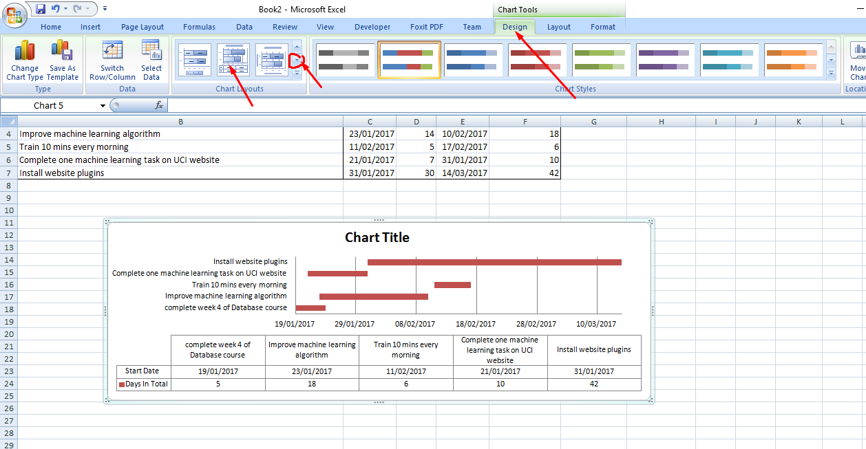
18. You can do further formatting as the TITLE, change bar colour and many other excel formatting, (text colour, font size etc). A sample result is as below: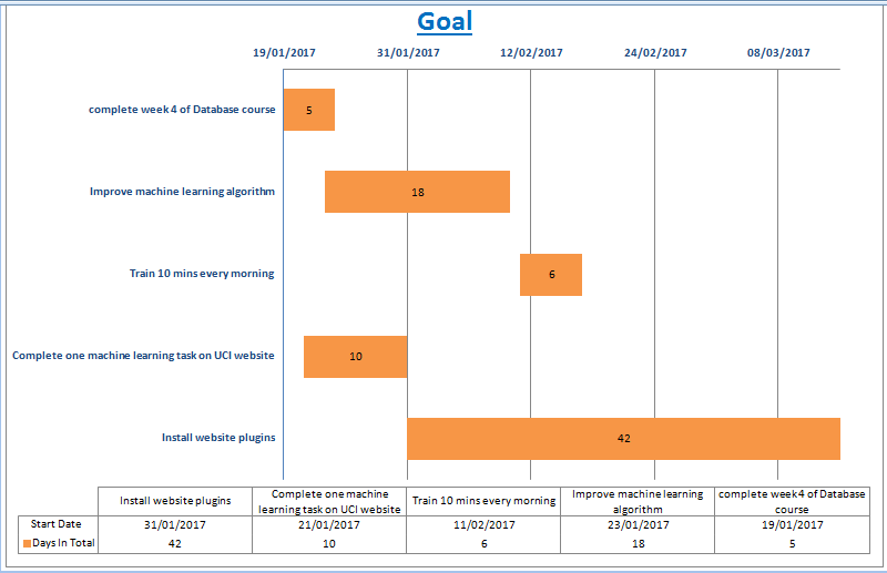
If you have any comments or questions please ask in the comment box below.
You can download the worksheet from here: Gantt Chart Worksheet
Summary:
- You learned how to put your data properly in excel to make your Gantt Chart easier and straight forward
- You learned how to create a simple Gantt Chart in Excel
- You learned how to place the Data and duration beneath chart itself for ease of understanding and interpretation
You can take this further. Good luck. Let me know if you have any questions or suggestions or other ways you create a Gantt Chart in the comment box below.