| | | | |

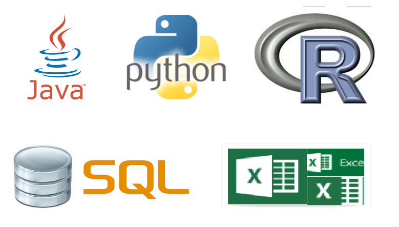
Java Python R SQL Excel Compared Similarities For Data Science and Data Analytics – The Basics

If you have ever worked with Java, Python, R, SQL, Excel and other Languages on a varied Data Science or Data Analytics projects, you will realise that all these languages have similar syntaxes, or at least, can achieve the same objective with very similar codes.


Below is a comparison and similarities of these various tools and programmes I put together for quick reference when I realised that there are some similarities between these languages languages and tools are.

Though it is not complete and exhaustive, I believe it will be of help to someone.

If you have any similarities amongst any of these languages, please leave it as a comment in the comment box I will update the table.

I would want this to help all new people who are into Data Science and Data Analytics as I wish I had something similar to this when I first started. Thank you for your contribution.


Navigating the table:

Please

  1. Use the search box located directly on the top right hand corner of the table to search for terms
  2. Use the scroll bar at the bottom of the table to see all columns
  3. The table has 5 columns which are Java, Python, R, SQL, Excel, Example,  Description


[table id=1 /]

Want more information like this?

Similar Posts

  • | | | |

    Free Entity Relationship and Relational Schema Diagram Tool

    ERDPLUS One tool I generally use when working on a projects, mini tasks and exploration is the ERDPLUS tool . It is quite simple and easy to use. It is a Free tool as well. Below are some diagrams I generated when i first got in contact with with tool. ERD DIAGRAMS: 1. 2.  A…

  • | | |

    K-Means Cluster Analysis – Data Analysis and Intrepretation

    Overview My research work deals with Ghana, a country from the Gapminder dataset as has already been discussed from the beginning and progression through this course I conducted a k-means cluster analysis to find out the underlying sets of the population of Ghana based on their similarity of responses on 22 variables that represent characteristics…

  • | |

    Exploring Statistical Analysis in the Context of Correlation – Testing a Potential Moderator

    Exploring Statistical Analysis in the Context of Correlation   Chosen Dataset I will be working with Data from the Gapminder dataset. This happens to be the same dataset I worked with under the Data Management and Visualization course assignments. As elaborated and discussed in under the Data Management and Visualization course assignments, I have chosen to focus on the country,…

  • | |

    Python Pandas Pivot Table Index location Percentage calculation on Two columns – XlsxWriter pt2

    This is a just a bit of addition to a previous post, by formatting the Excel output further using the Python XlsxWriter package. The additions are : Colour formatting has been added to the Total Cost column The “Total Cost” has been given a money formatting The above uses row : column numeric values instead…

  • Getting Python Spyder Anaconda IDE To Work Using Virtualenv

    If you have some Python scripts which rely on some packages that need a different version other than the version your Python Spyder uses, you can simply use Python Virtualenv to run Spyder IDE . This will save you a lot of headache and you can simply continue with your development projects. This tutorial will…

  • Matplotlib Pyplot Plt Python Pandas Data Visualization Plotting

      This is some quick notes about graphing or plotting graphs with Matplotlib in Python. Credits to sentdex.  You can check him out on Youtube.

      In [4]:

      In [10]:

      In [14]:

      In [20]:

      In [23]:

      In [30]:

      Out[30]:

    In [48]:

        Want more information like this?

Leave a Reply

Your email address will not be published. Required fields are marked *